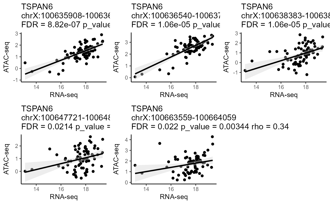
Correlation scatter plot.
CorrPlot.RdCorrelation scatter plot.
Arguments
- LinkageObject
An Linkage Object.
- gene
A gene that want to be visualized.
- color
The color of the straight line.
- fill
The color of the fill.
Examples
library(linkage)
data("SmallLinkageObject")
gene_list <- c("TSPAN6", "CD99", "KLHL13")
LinkageObject <-
  RegulatoryPeak(
    LinkageObject = SmallLinkageObject,
    gene_list = gene_list,
    genelist_idtype = "external_gene_name"
  )
CorrPlot(LinkageObject, gene = "TSPAN6")
#> `geom_smooth()` using formula = 'y ~ x'
#> `geom_smooth()` using formula = 'y ~ x'
#> `geom_smooth()` using formula = 'y ~ x'
#> `geom_smooth()` using formula = 'y ~ x'
#> `geom_smooth()` using formula = 'y ~ x'